

Overview:
While redesigning a complex internal sales tool at Dell Technologies, my team and I knew that the best way to move forward was to step back and listen to our users. We treated validation as a non-negotiable part of the process, ensuring every design decision was rooted in real-world feedback rather than assumptions. This case study walks through how that research-first approach helped us simplify a high-friction workflow and build a tool our sales reps actually enjoyed using.
Methodology:
As the lead researcher on this project, I orchestrated a two-week sprint to put our designs to the test with 14 real users. I guided another designer through seven remote, moderated sessions where we spent 50 minutes with participants gathering a mix of qualitative insights and quantitative data. By overseeing this deep dive, I ensured our team had a clear direction needed to move forward with total confidence.
What we tested:
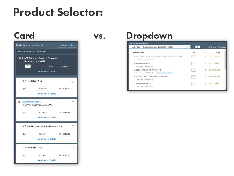
1. A/B Test: Product Selector - Card vs. Dropdown
To find the most efficient way for sales reps to switch products, we put two interactions, a card and a dropdown, head-to-head.
We wanted to know:
1- Findability. Since we moved the selector to a new spot on the page, our first goal was to ensure "findability" remained high and the change wasn't disruptive. Could users find the card and dropdown?
2- Task Completion. We also tracked task completion to see which design felt most intuitive, ensuring the final choice matched our users' mental models and kept their workflow seamless.
Findings:
1- Findability - 100% of users were able to find BOTH the card and dropdown
2- Task Completion - 100% of users were able to complete the task for BOTH card and dropdown
Result: Although both options tested exactly the same, I advocated for the dropdown to ensure the UI remained scalable as the products grows, it took up less real estate, and was easier to scan.
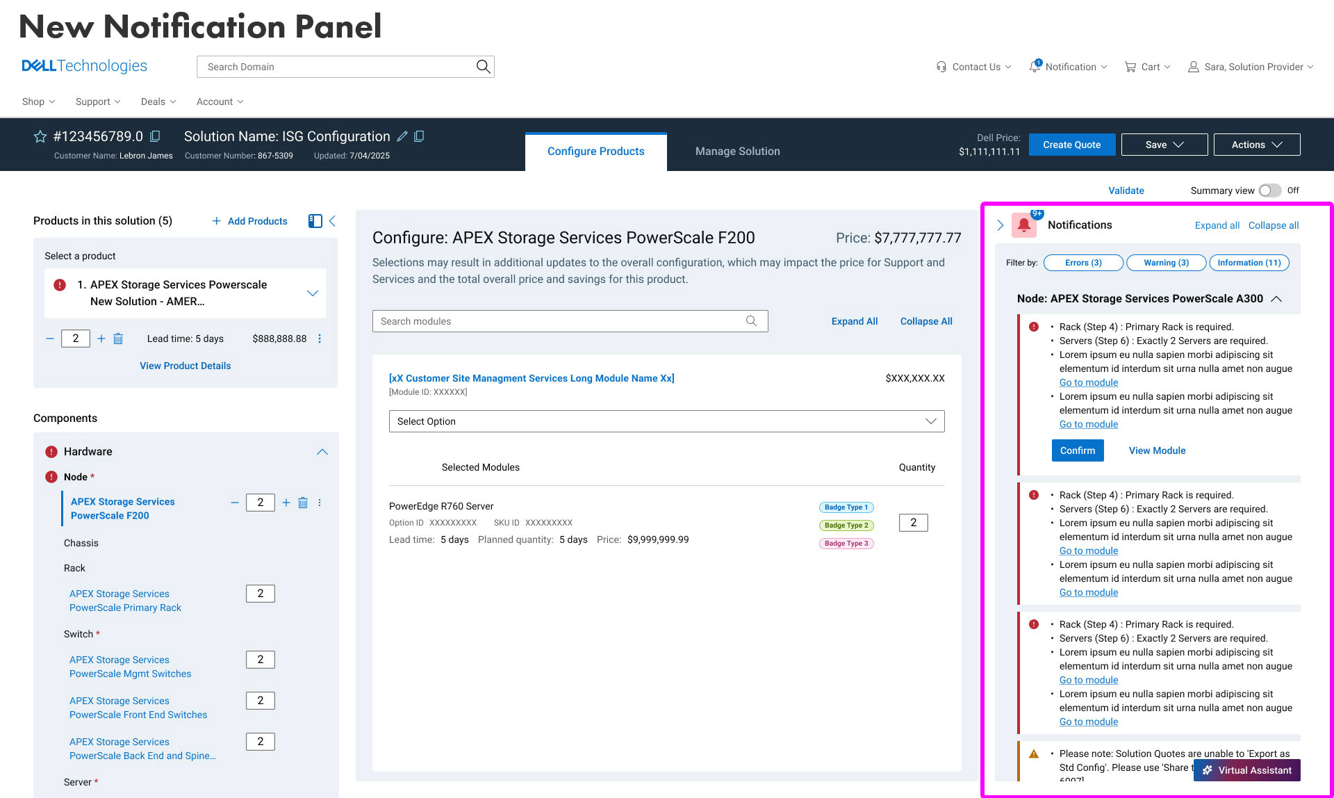
2. Notification Panel Usability
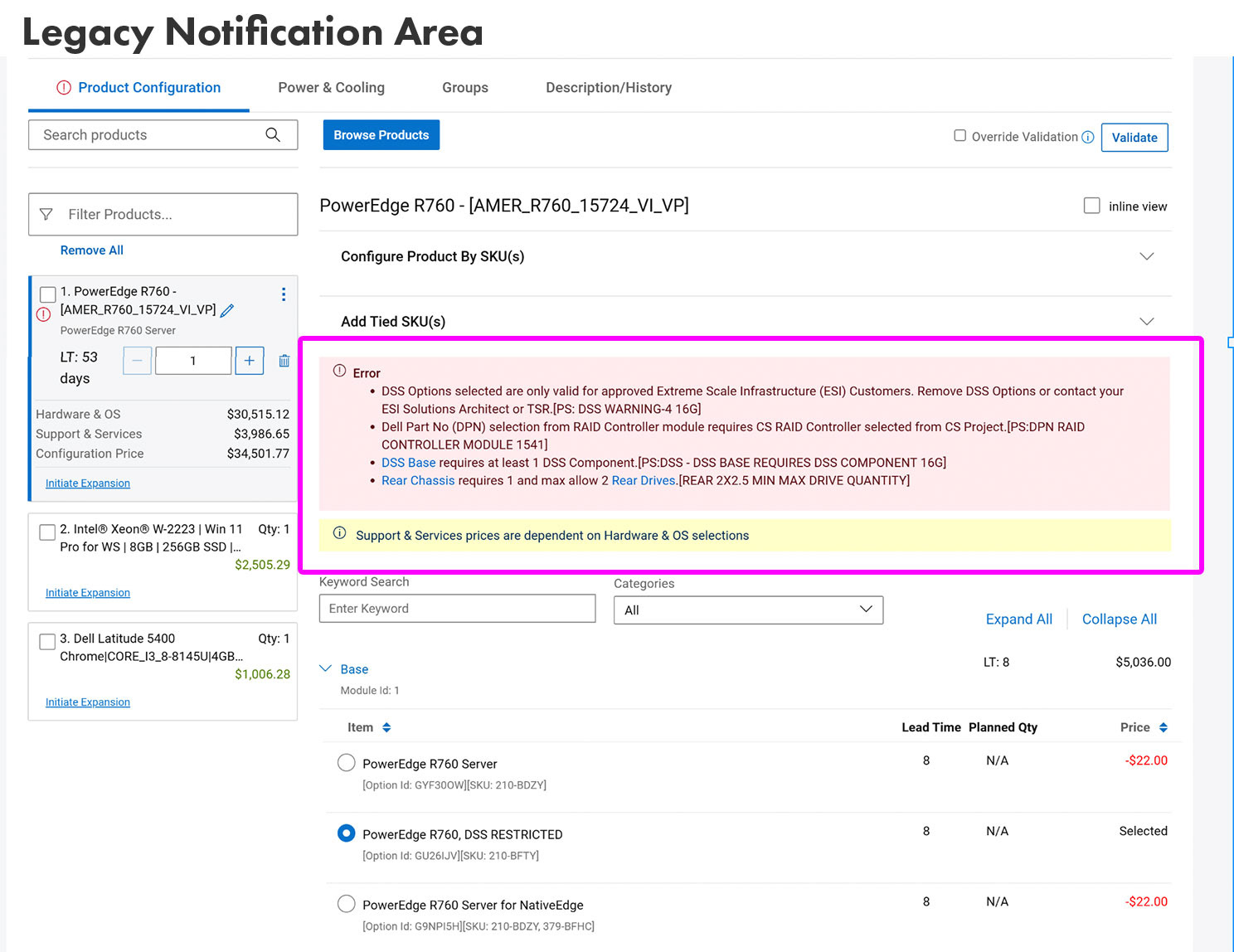
Next up, we took a look at how sales reps handle the constant stream of errors and warnings that pop up during configuration. In the old system, these lived at the very top of the page, which led to a lot of "scroll-fatigue" and mental clutter. To fix this, we moved everything into a dedicated notification panel, but we knew we had to prove it was actually better.
We wanted to know:
1- Findability. Could users find the notifications? With our new design, notifications were located in a dedicated notification panel.
2- Task Completion. We asked users to complete a simple task related to resolving an error. Completing the task would indicate the new design actually lightened their cognitive load instead of adding to it.
Findings:
1- Findability - 80% of users were able to find the notification panel.
2- Task Completion - 100% of users who found the notification panel were able to complete the task.
Result: I advocated for this design despite findability gaps, prioritizing long-term efficiency over immediate discovery. The substantial gains in reduced cognitive load and screen real estate significantly outweigh the initial learning curve.
3. New Solution Overview Tab
When you’re dealing with dozens of products on a single screen, it’s easy to get lost in the weeds. Our earlier research told us that sales reps were feeling overwhelmed and just wanted a high-level "bird’s-eye view" of their work without the clutter of every tiny detail. To solve this, we designed a new Solution Overview tab, and we were eager to see if it actually hit the mark.
We wanted to know:
1- General impressions. We focused our testing on how helpful the view really felt, what specific data points reps prioritized when looking at a solution holistically, and what actions they’d actually need to take while there to keep their workflow moving.
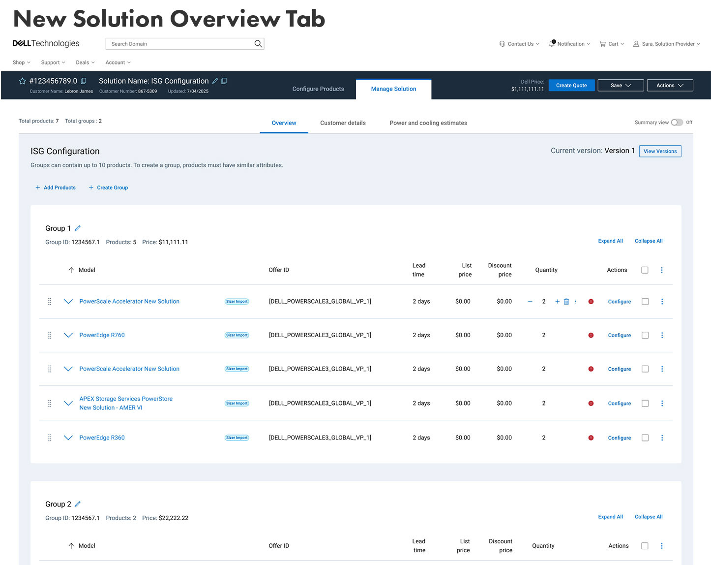
Findings:
This new tab received a CSAT of 78%, so relatively good. Since this was a brand new page, users had many ideas on what interactions and key pieces of information should be present on this tab. Some of this feedback was implemented for V1 and other ideas were prioritized for the V2 roadmap.
Quote from user: "Everything is right in front of you. We usually have to look to the side and verify. Quick and fast."
Retrospective
Validating design iterations against real-world user behavior is the ultimate defense against corporate assumptions. By introducing a structured, two-week validation loop for the Dell internal sales tool, this research initiative successfully replaced guessing with data, proving that enterprise software can be streamlined without sacrificing power or depth.