

The Challenge: Taming the "Efficiency of Misery"
At Dell Technologies, I led the redesign of the Solution Configurator, a high-stakes internal tool used by sales reps to build complex, multi-product orders. The legacy tool was a classic enterprise "beast": high cognitive load, infinite scrolling, and cryptic error messages.
However, the real challenge wasn't just the UI—it was Muscle Memory. Our reps were "efficiently miserable"; they had spent years memorizing the quirks of a bad system. My goal was to simplify the workflow without breaking the productivity of our power users.
The Strategy: Leadership Under Pressure
With a critically tight timeline and stakeholders who initially viewed user research as a "delay," I had to pivot the strategy. To keep development moving without flying blind, I relied on expert heuristics for the initial framework while negotiating a strategic compromise: Concurrent Design Environments.
Instead of debating unvalidated assumptions, we built competing design models into parallel live environments. This essentially turned a "no-time-for-testing" constraint into a real-world validation engine, allowing us to gather live performance data from sales reps while simultaneously delivering features on schedule.
How We Integrated UX Research "Under the Radar"
Because stakeholders were misaligned on the need for research, we couldn't rely on a traditional up-front discovery phase. Instead, we had to be highly tactical—conducting targeted user research and testing quietly in parallel while we were actively solutioning and building. To see the full breakdown of how we executed these high-impact user interviews, A/B testing, and contextual inquiries under the radar, check out my companion case study: [Link: https:kristenpiacenza.com/design-validation-through-user-testing].
Because stakeholders were misaligned on the need for research, we couldn't rely on a traditional up-front discovery phase. Instead, we had to be highly tactical—conducting targeted user research and testing quietly in parallel while we were actively solutioning and building. To see the full breakdown of how we executed these high-impact user interviews, A/B testing, and contextual inquiries under the radar, check out my companion case study: [Link: https:kristenpiacenza.com/design-validation-through-user-testing].
Deep-Diving into the Friction
My initial audit revealed four systemic failures that were draining user productivity and morale:
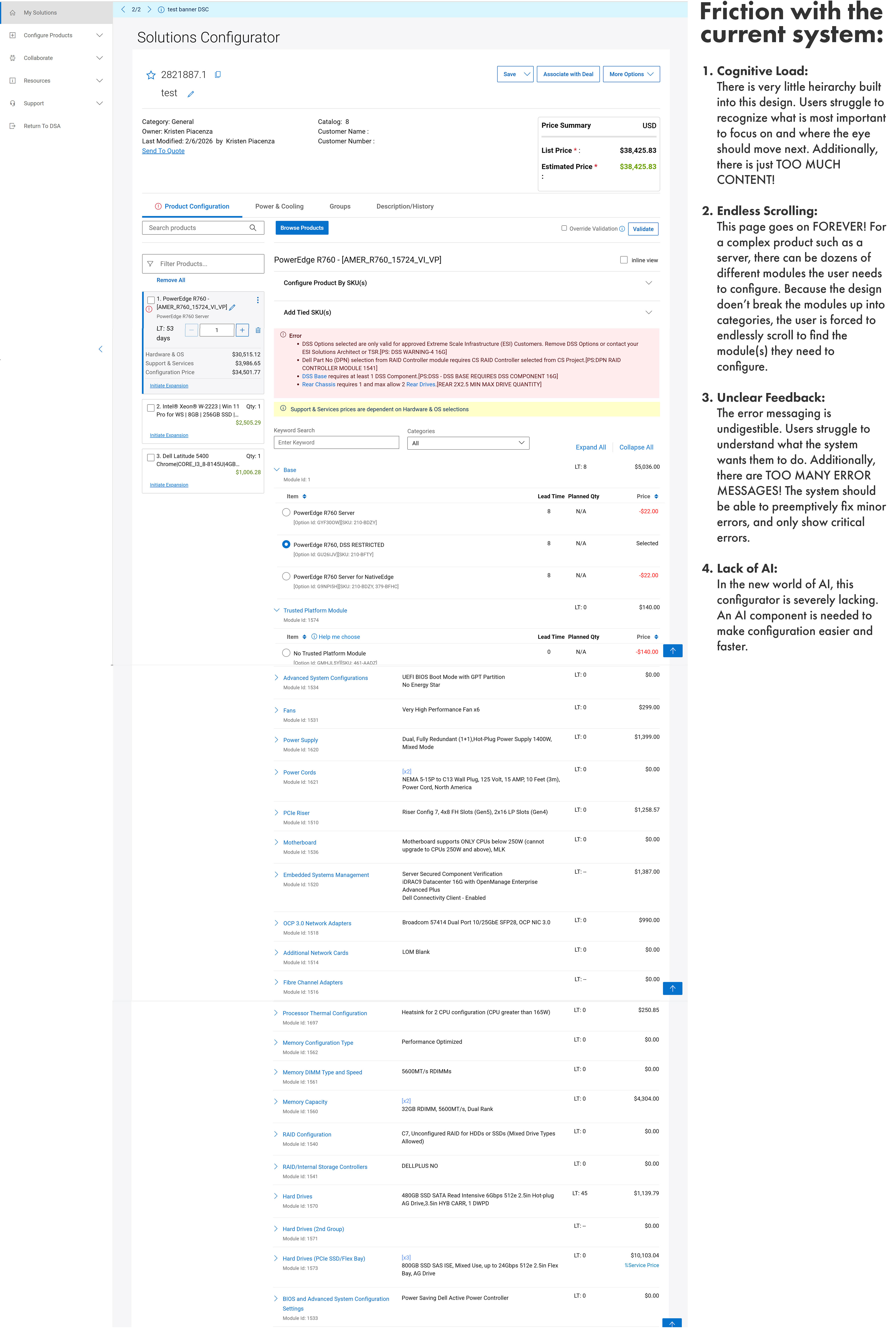
Paralyzing Cognitive Load: The UI lacked visual hierarchy. Every field, checkbox, and price point carried the same visual weight, forcing the brain to manually filter out 90% of the screen to find the 10% that mattered for the current task.
The "Infinite Scroll" Fatigue: To configure a single product, reps had to navigate a "wall of data" that spanned the equivalent of 15–20 vertical screens. Finding a specific module felt like searching for a needle in a haystack.
Undigestible Feedback Loops: The system didn't just give errors; it shouted them. Users were inundated with "Wall of Red" errors that were jargon-heavy alerts which failed to point to the actual source of the conflict, leading to manual troubleshooting.
No AI: The tool lacked any AI guidance. Integrating AI into the system was essential.
Solving the Legacy Friction
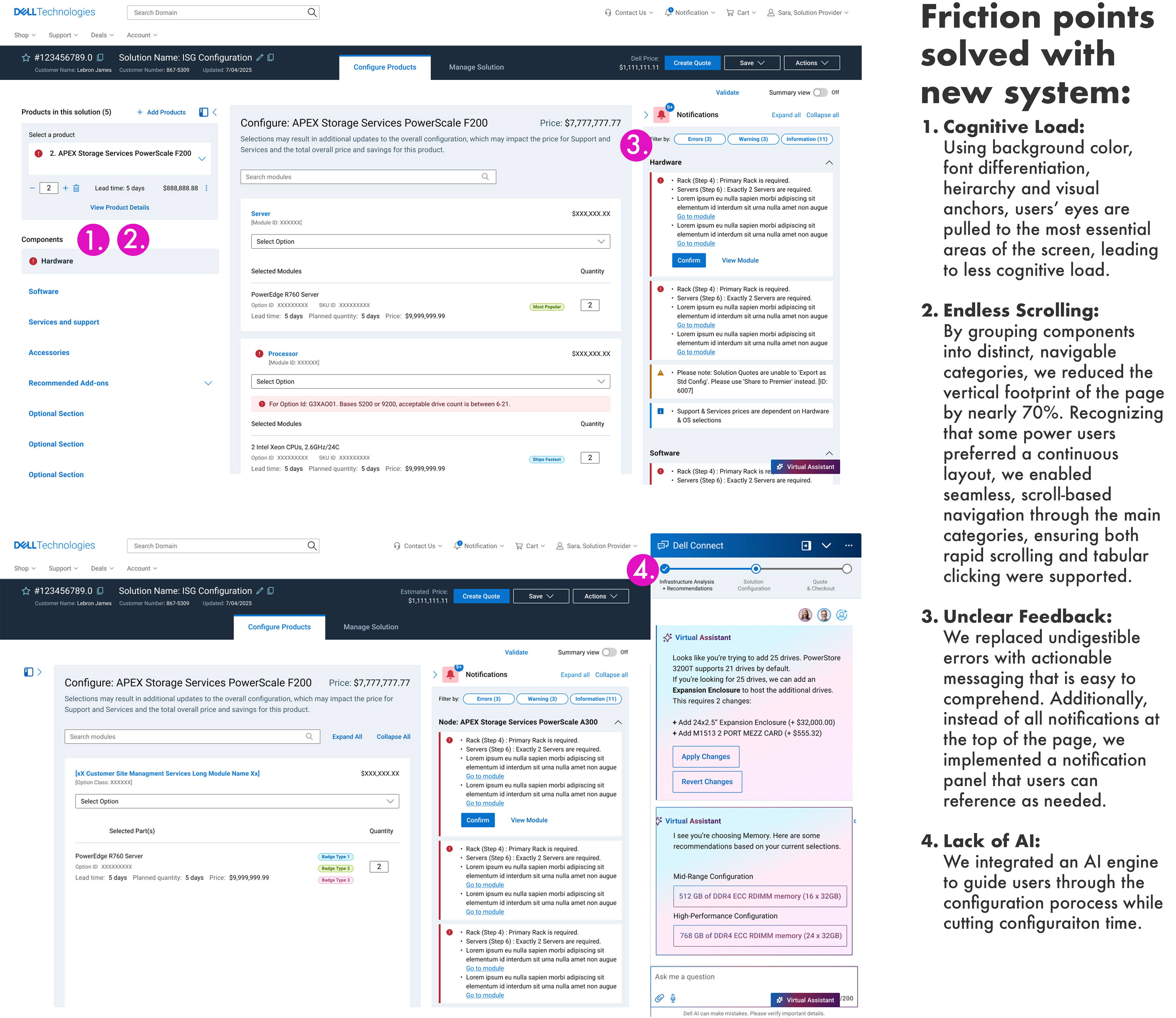
1. Reducing Cognitive Load through Information Hierarchy
The old system suffered from "visual noise". Every field and label shouted at the same volume. I applied Gestalt principles to reorganize the interface for "scannability."
The Process: I conducted a audit to identify redundant fields. We discovered that 30% of the on-screen data was "nice to know" but not "need to know" for a successful quote.
The Solution: We introduced Visual Anchors. We used high-contrast headers for primary actions, subtle ghost-text for secondary labels, and "Smart Defaults" that pre-filled common configurations.
The Result: By stripping away the non-essential, we lowered the user's "Cognitive Load Index." The reps’ eyes were now naturally pulled to the critical decision areas, reducing the mental fatigue that leads to costly ordering mistakes.
2. Eliminating "Infinite Scroll" via Progressive DisclosureThe legacy tool treated every configuration like a single, miles-long grocery list. To fix this, I moved away from a "flat" architecture toward Progressive Disclosure.
The Process: I led a mapping exercise to categorize configuration attributes into "High-Frequency" vs. "Edge Case."
The Solution: We implemented a multi-tabbed, modular workspace. By grouping related components (e.g., Power, Memory, Storage) into distinct, navigable categories, we reduced the vertical footprint of the page by nearly 70%. Recognizing that some power users preferred a continuous layout, we enabled seamless, scroll-based navigation through the main categories, ensuring both rapid scrolling and tabular clicking were supported.
The Result: Sales reps no longer had to hunt for a specific SKU; they knew exactly which tab to open, turning a 12-secpmd scroll into a 3-click interaction.
3. Translating "Undigestible" Error Messages into Actionable Feedback
The legacy tool used cryptic, jargon-heavy error codes that didn't explain how to fix the problem.
The Process: I spearheaded a collaboration with the technical writing and engineering teams to audit the error log. We categorized hundreds of codes into Action-Oriented Clusters.
The Solution: We replaced the "Wall of Red" at the top of the page with In-Context Validation. Instead of a generic error message, we placed a clear, human-readable alert (e.g., "Power supply insufficient for selected GPU") directly next to the conflicting component.
The Result: We transformed errors from "blockers" into "guideposts." Reps stopped calling support to translate codes and started resolving conflicts themselves in real-time, directly contributing to the 18% reduction in time-on-task.
4. Introducing Intelligent Workflows via Explainable AI
Previously, there was no automated guidance to help users navigate complex product configuration, leaving reps to manually piece together intricate system designs from scratch. To solve this, we introduced a first-of-its-kind AI "helper" component into the workspace.
The Process: I partnered with data science, product management, and engineering teams to define the behavioral rules for the machine learning models. Because users initially resisted this "black box," I facilitated design workshops to determine how to surface complex algorithms in a way that felt like a transparent, helpful supportive partnership rather than automated enforcement.
The Solution: We designed an integrated AI recommendation engine featuring Explainable AI (XAI) patterns. The tool dynamically surfaced optimal product combinations and guided users through complex configuration dependencies with short, human-readable logic cues explaining the "why" behind every smart suggestion.
The Result: We successfully turned skepticism into adoption. During pilot testing, users leveraging the AI recommendations completed complex builds 3 minutes faster than those using the manual tabs alone. The transparent AI guidance drastically cut configuration time, eliminated technical guesswork for complex builds, and served as the primary catalyst behind our 22% increase in customer satisfaction (CSAT) scores.
TL;DR / Retrospective Summary
Redesigning an enterprise pillar like the Dell Solution Configurator requires balancing radical simplification with deep respect for power-user muscle memory. By shifting from a flat, high-friction architecture to a progressive, AI-assisted workspace, this initiative successfully modernized a legacy system under immense timeline constraints.
Key Takeaways
Business Impact: Achieved a 22% increase in CSAT scores and an 18% reduction in time-on-task within configuration.
Pragmatic Research: When traditional discovery timelines were cut, implementing concurrent design environments allowed us to gather live performance metrics without stalling engineering velocity.
The Power of Transparency: Introducing Explainable AI (XAI) proved that enterprise adoption relies on trust. Explaining the "why" behind recommendations turned user skepticism into a primary driver of efficiency.
Ultimately, this project proved that enterprise UX isn't about stripping away complexity—it's about organizing it so users can move from "efficiently miserable" to genuinely empowered.